linkedin-skill-assessments-quizzes
CSS
Q1. Among these selectors which selector has the highest specificity ranking for selecting the anchor link element?
ul li a
a
.example a
div a
.example adiv aaul li a
Q2. Using an attribute selector, how would you select an <a> element with a “title” attribute?
a[title]{...}a > title {...}a.title {...}a=title {...}
Note: an alternative to the question below.
Q3. What is the CSS selector for an <a> tag containing the title attribute?
a[title]a > titlea=titlea.title
Note: an alternative to the question above.
Q4. CSS grid and flexbox are now becoming a more popular way to create page layouts. However, floats are still commonly used, especially when working with an older code base, or if you need to support an older browser version. What are two valid techniques used to clear floats?
- Use the “clearfix hack” on the floated element and add a float to the parent element.
- Use the overflow property on the floated element or the “clearfix hack” on either the floated or parent element.
- Use the “clearfix hack” on the floated element or the overflow property on the parent element.
- Use the “clearfix hack” on the parent element or use the overflow property with a value other than “visible.”
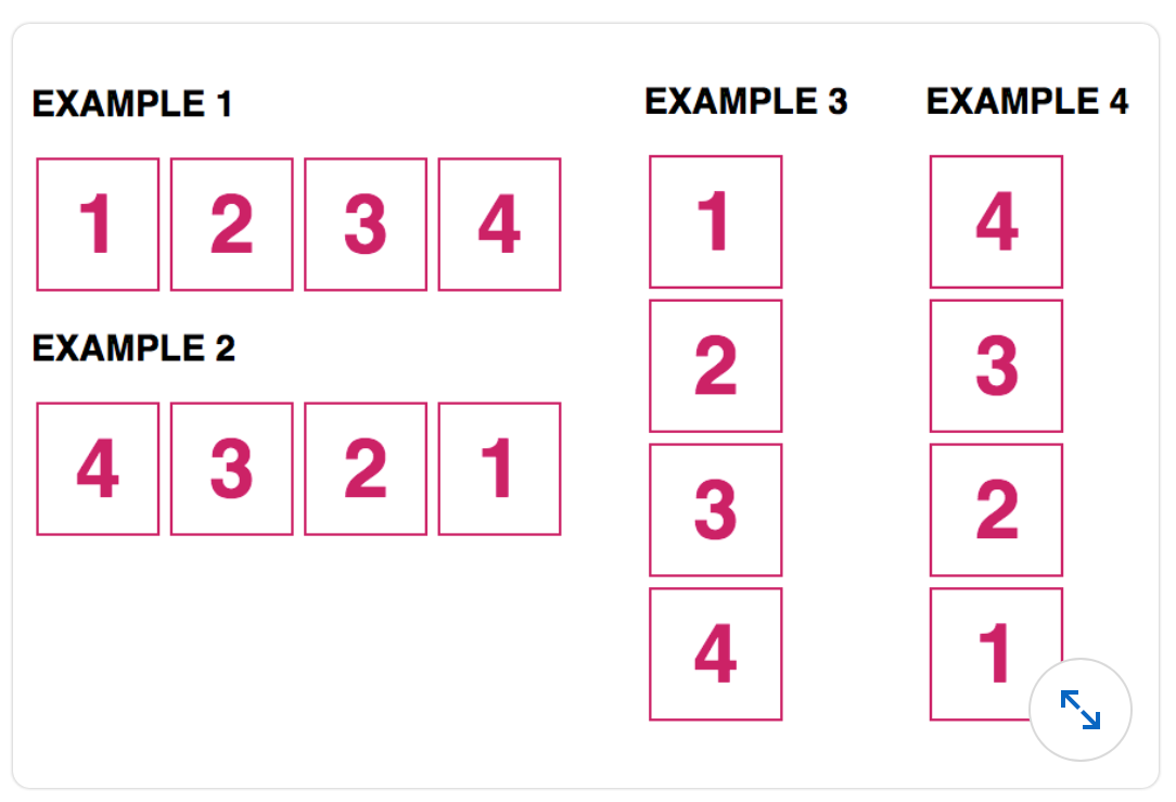
Q5. What element(s) do the following selectors match?
1) .nav {
  ...;
}
2) nav {
  ...;
}
3) #nav {
  ...;
}
- A
  1. An element with an ID of "nav"
  2. A nav element
  3. An element with a class of "nav"
- B
They all target the same nav element. - C
  1. An element with a class of "nav"
  2. A nav element
  3. An element with an id of "nav"
- D
  1. An element with a class of "nav"
  2. A nav element
  3. A div with an id of "nav"
Q6. When adding transparency styles, what is the difference between using the opacity property versus the background property with a rgba() value?
- Opacity specifies the level of transparency of the child elements. Background with a
rgba()value applies transparency to the background color only. - Opacity applies transparency to the background color only. Background with an
rgba()value specifies the level of transparency of an element, as a whole, including its content. - Opacity specifies the level of transparency of an element, including its content. Background with a
rgba()value applies transparency to the background color only. - Opacity applies transparency to the parent and child elements. Background with a
rgba()value specifies the level of transparency of the parent element only.
Q7. What is true of block and inline elements? (Alternative: Which statement about block and inline elements is true?)
- By default, block elements are the same height and width as the content container between their tags; inline elements span the entire width of its container.
- By default, block elements span the entire width of their container; inline elements are the same height and width as the content contained between their tags.
- A
<nav>element is an example of an inline element.<header>is an example of a block element. - A
<span>is an example of a block element.<div>is an example of an inline element.
Q8. CSS grid introduced a new length unit, fr, to create flexible grid tracks. Referring to the code sample below, what will the widths of the three columns be?
.grid {
  display: grid;
  width: 500px;
  grid-template-columns: 50px 1fr 2fr;
}
- The first column will have a width of 50px. The second column will be 50px wide and the third column will be 100px wide.
- The first column will have a width of 50px. The second column will be 150px wide and the third column will be 300px wide.
- The first column will have a width of 50px. The second column will be 300px wide and the third column will be 150px wide.
- The first column will have a width of 50px. The second column will be 500px wide and the third column will be 1000px wide.
Note:an alternative to the question below.`
Q9. If the width of the container is 500 pixels, what would the width of the three columns be in this layout?
.grid { display: grid; grid-template-columns: 50px 1fr 2fr; }
- 50px, 150px, 300px
- 50px, 200px, 300px
- 50px, 100px, 200px
- 50px, 50px, 100px
Note:an alternative to the question above.`
Q10. What is the use of line-height property?
- to control the height of the space between two lines of content
- to control the height of the space between heading elements
- to control the height of the character size
- to control the width of the space between characters
Q11. Three of these choices are true about class selectors. Which is NOT true?
- Multiple classes can be used within the same element.
- The same class can be used multiple times per page.
- Class selectors begin with a leading period
- Classes can be used multiple times per page but not within the same element.
Note:an alternative to the question below.`
Q12. What is not true about class selectors?
- Only one class value can be assigned to an element.
- An element can have multiple class values.
- Class selectors are marked with a leading period.
- More than one element can have the same class value.
Note:an alternative to the question above.`
Q13. There are many properties that can be used to align elements and create page layouts such as float, position, flexbox, and grid. Of these four properties, which one should be used to align a global navigation bar that stays fixed at the top of the page?
- position
- flexbox
- grid
- float
Q14. In the shorthand example below, which individual background properties are represented?
background: blue url(image.jpg) no-repeat scroll 0px 0px;
- A
background-color: blue;
background-image: url(image.jpg);
background-repeat: no-repeat;
background-attachment: scroll;
background-position: 0px 0px;
- B
background-color: blue;
background-img: URL(image.jpg);
background-position: no-repeat;
background-scroll: scroll;
background-size: 0px 0px;
- C
background-color: blue;
background-src: URL(image.jpg);
background-repeat: no-repeat;
background-wrap: scroll;
background-position: 0px 0px;
- D
background-color: blue;
background-src: URL(image.jpg);
background-repeat: no-repeat;
background-scroll: scroll;
background-position: 0px 0px;
Q15. In this example, according to cascading and specificity rules, what color will the link be?
.example {
  color: yellow;
}
ul li a {
  color: blue;
}
ul a {
  color: green;
}
a {
  color: red;
}
<ul>
  <li><a href="#" class="example">link</a></li>
  <li>list item</li>
  <li>list item</li>
</ul>
- green
- yellow
- blue
- red
Q16. When elements overlap, they are ordered on the z-axis (i.e., which element covers another). The z-index property can be used to specify the z-order of overlapping elements. Which set of statements about the z-index property are true?
- Larger z-index values appear on top of elements with a lower z-index value. Negative and positive numbers can be used. z-index can only be used on positioned elements.
- Smaller z-index values appear on top of elements with a larger z-index value. Negative and positive numbers can be used. z-index must also be used with positioned elements.
- Larger z-index values appear on top of elements with a lower z-index value. Only positive numbers can be used. z-index must also be used with positioned elements.
- Smaller z-index values appear on top of elements with a larger z-index value. Negative and positive numbers can be used. z-index can be used with or without positioned elements.
Note:an alternative to the question below.`
Q17. When elements within a container overlap, the z-index property can be used to indicate how those items are stacked on top of each other. Which set of statements is true?
- A
  1. Larger z-index values appear on top elements with a lower z-index value.
  2. Negative and positive numbers can be used.
  3. The z-index can be used only on positioned elements.
- B
  1. Smaller z-index values appear on top of elements with a larger z-index value.
  2. Negative and positive numbers can be used.
  3. The z-index can be used with or without positioned elements.
- C
  1. Smaller z-index values appear on top of elements with a larger z-index value.
  2. Negative and positive numbers can be used.
  3. The z-index must also be used with positioned elements.
- D
  1. Larger z-index values appear on top of elements with a lower z-index value.
  2. Only a positive number can be used.
  3. The z-index must also be used with positioned elements.
Note:an alternative to the question above.`
Q18. What is the difference between the following line-height settings?
line-height: 20px;
line-height: 2;
- The value of 20px will set the line-height to 20px. The value of 2 will set the line height to twice the size of the corresponding font-size value.
- The value of 20px will set the line-height to 20px. The value of 2 is not valid.
- The value of 20px will set the line-height to 20px. The value of 2 will default to a value of 2px.
- The value of 20px will set the line-height to 20px. The value of 2 will set the line height to 20% of the corresponding font-size value.
Q19. In the following example, what color will paragraph one and paragraph two be? (Alternative: In this example, what color will paragraphs one and two be?)
<section>
  <p>paragraph one</p>
</section>

<p>paragraph two</p>
section p {
  color: red;
}
section + p {
  color: blue;
}
- Paragraph one will be blue, and paragraph two will be red.
- Both paragraphs will be blue.
- Paragraph one will be red, and paragraph two will be blue.
- Both paragraphs will be red.
Q20. What are three valid ways of adding CSS to an HTML page?
- A
  1. External; CSS is written in a separate file.
  2. Inline; CSS is added to the <head> of the HTML page.
  3. Internal; CSS is included within the HTML tags.
- B
  1. External; CSS is written in a separate file and is linked within the <header> element of the HTML file.
  2. Inline; CSS is added to the HTML tag.
  3. Internal; CSS is included within the <header> element of the HTML file.
- C
  1. External; CSS is written in a separate file and is linked within the <head> element of the HTML file.
  2. Internal; CSS is included within the <header> element of the HTML file.
  3. Inline; CSS is added to the HTML tag.
- D
  1. External; CSS is written in a separate file and is linked within the <head> element of the HTML file.
  2. Inline; CSS is added to the HTML tag.
  3. Internal; CSS is included within the <head> element of the HTML file.
Q21. Which statement is true for the SVG image format?
- CSS can be applied to SVG but JavaScript cannot be.
- SVGs work best for creating 3D graphics.
- SVGs can be created as a vector graphic or coded using SVG-specific elements such as <svg>, < line>, and < ellipse>.
- SVGs are a HAML-based markup language for creating vector graphics.
Q22. In the example below, when will the color pink be applied to the anchor element?
a:active {
  color: pink;
}
- The color of the link will display as pink after it has been clicked or if the mouse is hovering over the link.
- The color of the link will display as pink on mouse hover.
- The color of the link will display as pink while the link is being clicked but before the mouse click is released.
- The color of the link will display as pink before it has been clicked.
Q23. To change the color of an SVG using CSS, which property is used?
- Use background-fill to set the color inside the object and stroke or border to set the color of the border.
- The color cannot be changed with CSS.
- Use fill or background to set the color inside the object and stroke to set the color of the border.
- Use fill to set the color inside the object and stroke to set the color of the border.
Q24. When using position: fixed, what will the element always be positioned relative to?
- the closest element with position: relative
- the viewport
- the parent element
- the wrapper element
Q25. By default, a background image will repeat _
- only if the background-repeat property is set to repeat
- indefinitely, vertically, and horizontally
- indefinitely on the horizontal axis only
- once, on the x and y axis
Q26. When using media queries, media types are used to target a device category. Which choice lists current valid media types?
- print, screen, aural
- print, screen, television
- print, screen, speech
- print, speech, device
Q27. How would you make the first letter of every paragraph on the page red?
- p::first-letter { color: red; }
- p:first-letter { color: red; }
- first-letter::p { color: red; }
- first-letter:p { color: red; }
Q28. In this example, what is the selector, property, and value?
p {
  color: #000000;
}
- A
  "p" is the selector
  "#000000" is the property
  "color" is the value
- B
  "p" is the selector
  "color" is the property
  "#000000" is the value
- C
  "color" is the selector
  "#000000" is the property
  "#p" is the value
- D
  "color" is the selector
  "p" is the property
  "#000000" is the value
Q29. What is the rem unit based on?
- The rem unit is relative to the font-size of the p element.
- You have to set the value for the rem unit by writing a declaration such as rem { font-size: 1 Spx; }
- The rem unit is relative to the font-size of the containing (parent) element.
- The rem unit is relative to the font-size of the root element of the page.
Q30. Which choice would give a block element rounded corners?
corner-radius: 10px;border-corner: 10px;corner-curve: 10px;border-radius: 10px;
Q31. In the following media query example, what conditions are being targeted?
@media (min-width: 1024px), screen and (orientation: landscape) { … }
- The rule will apply to a device that has either a width of 1024px or wider or is a screen device in landscape mode.
- The rule will apply to a device that has a width of 1024px or narrower and is a screen device in landscape mode.
- The rule will apply to a device that has a width of 1024px or wider and is a screen device in landscape mode.
- The rule will apply to a device that has a width of 1024px or narrower or is a screen device in landscape mode.
Q32. CSS transform properties are used to change the shape and position of the selected objects. The transform-origin property specifies the location of the element’s transformation origin. By default, what is the location of the origin?
- the top left corner of the element
- the center of the element
- the top right corner of the element
- the bottom left of the element
Q33. Which of the following is not a valid color value? (Alternative: Which choice is not a valid color value?)
color: #000color: rgb(0,0,0)color: #000000color: 000000
Q34. What is the vertical gap between the two elements below?
<div style="margin-bottom: 2rem;">Div 1</div>
<div style="margin-top: 2rem;">Div 2</div>
- 2rem
- 32px
- 64px
- 4rem
Q35. When using the Flexbox method, what property and value is used to display flex items in a column?
- flex-flow: column; or flex-direction: column;
- flex-flow: column;
- flex-column: auto;
- flex-direction: column;
Q36. Which type of declaration will take precedence?
- any declarations in user-agent stylesheets
- important declarations in user stylesheets
- normal declarations in author stylesheets
- important declarations in author stylesheets
Q37. The flex-direction property is used to specify the direction in which flex items are displayed. What are the values used to specify the direction of the items in the following examples?
-
- Example 1:
flex-direction: row; - Example 2:
flex-direction: row-reverse; - Example 3:
flex-direction: column; - Example 4:
flex-direction: column-reverse;
- Example 1:
-
- Example 1:
flex-direction: row-reverse; - Example 2:
flex-direction: row; - Example 3:
flex-direction: column-reverse; - Example 4:
flex-direction: column;
- Example 1:
-
- Example 1:
flex-direction: row; - Example 2:
flex-direction: row-reverse; - Example 3:
flex-direction: column; - Example 4:
flex-direction: reverse-column;
- Example 1:
-
- Example 1:
flex-direction: column; - Example 2:
flex-direction: column-reverse; - Example 3:
flex-direction: row; - Example 4:
flex-direction: row-reverse;
- Example 1:
Q38. There are two sibling combinators that can be used to select elements contained within the same parent element; the general sibling combinator (~) and the adjacent sibling combinator (+). Referring to the example below, which elements will the styles be applied to?
h2 ~ p {
  color: blue;
}
h2 + p {
  background: beige;
}
<section>
  <p>paragraph 1</p>
  <h2>Heading</h2>
  <p>paragraph 2</p>
  <p>paragraph 3</p>
</section>
- Paragraphs 2 and 3 will be blue. The h2 and paragraph 2 will have a beige background.
- Paragraphs 2, and 3 will be blue, and paragraph 2 will have a beige background.
- Paragraph 2 will be blue. Paragraphs 2 and 3 will have a beige background.
Note: a variant of the question below.
Q39. Which element(s) will be blue?
h2 ~ p {
  color: blue;
}
<section>
  <p>P1</p>
  <h2>H2</h2>
  <p>P3</p>
  <p>P4</p>
</section>
- P3
- P1, P3 and P4
- P3 and P4
- P1
Q40. When using Flexbox, the “justify-content” property can be used to distribute the space between the flex items along the main axis. Which value should be used to evenly distribute the flex items within the container shown below?
- justify-content: space-around;
- justify-content: center;
- justify-content: auto;
- justify-content: space-between;
Q41. There are many advantages to using icon fonts. What is one of those advantages?
- Icon fonts increase accessibility.
- Icon fonts can be used to replace custom fonts.
- Icon fonts can be styled with typography-related properties such as font-size and color.
- Icon fonts are also web-safe fonts.
Q42. What is the difference between display:none and visibility:hidden?
- Both will hide the element on the page, but display:none has greater browser support. visibility:hidden is a new property and does not have the best browser support
- display:none hides the elements but maintains the space it previously occupied. visibility:hidden will hide the element from view and remove it from the normal flow of the document
- display:none hides the element from view and removes it from the normal flow of the document. visibility:hidden will hide the element but maintain the space it previously occupied.
- There is no difference; both will hide the element on the page
Q43. What selector and property would you use to scale an element to be 50% smaller on hover?
- element:hover {scale: 0.5;}
- element:hover {transform: scale(0.5);}
- element:hover {scale: 50%;}
- element:hover {transform: scale(50%);}
Q44. Which statement regarding icon fonts is true?
- Icon fonts can be inserted only using JavaScript.
- Icon fonts are inserted as inline images.
- Icon fonts require browser extensions.
- Icon fonts can be styled with typography-related properties such as font-size and color.
Q45. The values for the font-weight property can be keywords or numbers. For each numbered value below, what is the associated keyword?
font-weight: 400;
font-weight: 700;
- bold; normal
- normal; bold
- light; normal
- normal; bolder
Q46. Using the :nth-child pseudo-class, what would be the most efficient way to style every third item in a list, no matter how many items are present, starting with item 2?
- A
li:nth-child(3 + 2n) {
  margin: 0 5px;
}
- B
li:nth-child(3n + 2) {
  margin: 0 5px;
}
- C
li:nth-child(2),
li:nth-child(5),
li:nth-child(8) {
  margin: 0 5px;
}
- D
li:nth-child(2n + 3) {
  margin: 0 5px;
}
Q47. Which selector would select only internal links within the current page?
a[href="#"] {...}a[href~="#"]a[href^="#"]a[href="#"]
Q48. What is the difference between the margin and padding properties?
- Margin adds space around and inside of an element; padding adds space only inside of an element.
- Margin adds space around an element; padding adds space inside of an element.
- Margin adds a line around an element, and padding adds space inside of an element.
- Margin adds space inside of an element, and padding adds space around an element.
Q49. What is not a valid way of declaring a padding value of 10 pixels on the top and bottom, and 0 pixels on the left and right?
- padding: 10px 10px 0px 0px;
- padding: 10px 0px;
- padding: 10px 0;
- padding: 10px 0px 10px 0px;
Q50. Is there an error in this code? If so, find the best description of the problem
@font-face {
  font-family: 'Avenir', sans-serif;
  src:
    url('avenir.woff2') format('woff2'),
    url('avenir.woff') format('woff');
}
- The font file formats are not supported in modern browsers.
- The src attribute requires a comma between the URL and format values.
- There are no errors in the example.
- The sans-serif inclusion is problematic.
Q51. Which style places an element at a fixed location within its container?
- position: absolute;
- display: flex;
- display: block;
- float: left;
Q52. The calc() CSS function is often used for calculating relative values. In the example below, what is the specified margin-left value?
.example {
  margin-left: calc(5% + 5px);
}
- The left margin value is equal to 5% of its parent element’s width plus 5px
- The left margin value is equal to 5% of the viewport width plus 5px
- The left margin value is equal to 5% of the closest positioned element’s width plus 5px
- The left margin value is equal to 5% of the selected element’s width (.example) plus 5px
Q53. Which code would you use to absolutely position an element of the logo class?
.logo { position: absolute; left: 100px; top: 150px; }.logo { position: absolute; margin-left: 100px; margin-top: 150px; }.logo { position: absolute; padding-left: 100px; padding-top: 150px; }.logo { position: absolute; left-padding: 100px; top-padding: 150px; }
Q54. In this example, what color will Paragraph 1 be?
p:first-of-type {
  color: red;
}
p {
  color: blue;
}
.container {
  color: yellow;
}
p:first-child {
  color: green;
}
<div class="container">
  <h1>Heading</h1>
  <p>Paragraph1</p>
  <p>Paragraph2</p>
</div>
- blue
- green
- red
- yellow
Q55. What is the ::placeholder pseudo-element used for?
- It is used to format the appearance of placeholder text within a form control.
- It specifies the default input text for a form control.
- It writes text content into a hyperlink tooltip.
- It writes text content into any page element.
Q56. Which statement is true of the single colon (:) or double colon (::) notations for pseudo-elements-for example, ::before and :before?
- All browsers support single and double colons for new and older pseudo-elements. So you can use either but it is convention to use single colons for consistency.
- In CSS3, the double colon notation (
::) was introduced to create a consistency between pseudo-elements from pseudo-classes. For newer browsers, use the double colon notation. For IE8 and below, use single colon notation (:). - Only the new CSS3 pseudo-elements require the double colon notation while the CSS2 pseudo-elements do not.
- In CSS3, the double colon notation (
::) was introduced to differentiate pseudo-elements from pseudo-classes. However, modern browsers support both formats. Older browsers such as IE8 and below do not.
Q57. Which choice is not a valid value for the font-style property?
- normal
- italic
- none
- oblique
Q58. When would you use the @font-face method?
- to set the font size of the text
- to load custom fonts into stylesheet
- to change the name of the font declared in the font-family
- to set the color of the text
Q59. You have a large image that needs to fit into a 400 x 200 pixel area. What should you resize the image to if your users are using Retina displays?
- 2000 x 1400 pixels
- 200 x 100 pixels
- 800 x 400 pixels
- 400 x 200 pixels
Q60. In Chrome’s Developer Tools view, where are the default styles listed?
- under the User Agent Stylesheet section on the right
- in the third panel under the Layout tab
- under the HTML view on the left
- in the middle panel
Q61. While HTML controls document structure, CSS controls ___.
- semantic meaning
- content meaning
- document structure
- content appearance
Q62. What is the recommended name you should give the folder that holds your project’s images?
- images
- #images
- Images
- my images
Q63. What is the advantage of using inline CSS?
- It is easier to manage.
- It is easier to add multiple styles through it.
- It can be used to quickly test local CSS overrides.
- It reduces conflict with other CSS definition methods.
Q64. Which W3C status code represents a CSS specification that is fully implemented by modern browsers?
- Proposed Recommendation
- Working Draft
- Recommendation
- Candidate Recommendation
Q65. Are any of the following declarations invalid?
color: red; /* declaration A */
font-size: 1em; /* declaration B */
padding: 10px 0; /* declaration C */
- Declaration A is invalid.
- Declaration B is invalid.
- Declaration C is invalid.
- All declarations are valid.
Q66. Which CSS will cause your links to have a solid blue background that changes to semitransparent on hover?
- A
a:link {
  background: #0000ff;
}
a:hover {
  background: rgba(0, 0, 255, 0.5);
}
- B
a {
  color: blue;
}
a:hover {
  background: white;
}
- C
a:link {
  background: blue;
}
a:hover {
  color: rgba(0, 0, 255, 0.5);
}
- D
a:hover {
  background: rgba(blue, 50%);
}
a:link {
  background: rgba(blue);
}
Q67. Which CSS rule takes precedence over the others listed?
div.sidebar {}* {}div#sidebar2 p {}.sidebar p {}
Q68. The body of your page includes some HTML sections. How will it look with the following CSS applied?
body {
  background: #ffffff; /* white */
}
section {
  background: #0000ff; /* blue */
  height: 200px;
}
- blue sections on a white background
- Yellow sections on a blue background
- Green sections on a white background
- blue sections on a red background
Q69. Which CSS keyword can you use to override standard source order and specificity rules?
!elevate!*primeoverride!important
Q70. You can use the ___ pseudo-class to set a different color on a link if it was clicked on.
a:visiteda:hovera:linka:focus
Q71. Which color will look the brightest on your screen, assuming the background is white?
background-color: #aaa;background-color: #999999;background-color: rgba(170,170,170,0.5);background-color: rgba(170,170,170,0.2);
Q72. Which CSS selector can you use to select all elements on your page associated with the two classes header and clear?
."header clear" {}header#clear {}.header.clear {}.header clear {}
Q73. A universal selector is specified using a(n) ___.
- “h1” string
- “a” character
- “p” character
- ”*” character
Q74. In the following CSS code, 'h1' is the ___, while 'color' is the ___.
h1 {
  color: red;
}
- property; declaration
- declaration; rule
- “p” character
- selector; property
Q75. What is an alternate way to define the following CSS rule?
font-weight: bold;
- font-weight: 400;
- font-weight: medium;
- font-weight: 700;
- font-weight: Black;
Q76. You want your styling to be based on a font stack consisting of three fonts. Where should the generic font for your font family be specified?
- It should be the first one on the list.
- Generic fonts are discouraged from this list.
- It should be the last one on the list.
- It should be the second one on the list.
Q77. When using a font stack to declare the font family, in what order should the values appear?
- The first value is the first choice, followed by alternative options, ordered by preference. The last option should be a generic font.
- The first value is the first choice. The order of the alternative options does not matter. It depends on what is available on the user’s computer.
- The first value is the first choice, and must be followed by at least one alternative option before adding the generic font.
- The first value is the first choice, followed by a maximum of three alternatives.
Q78. What is one disadvantage of using a web font service?
- It requires you to host font files on your own server.
- It uses more of your site’s bandwidth.
- It offers a narrow selection of custom fonts.
- It is not always a free service.
Q79. How do you add Google fonts to your project?
- by using an HTML link element referring to a Google-provided CSS
- by embedding the font file directly into the project’s master JavaScript
- by using a Google-specific CSS syntax that directly links to the desired font file
- by using a standard font-face CSS definition sourcing a font file on Google’s servers
Q80. Using the following HTML and CSS example, what will the equivalent pixel value be for .em and .rem elements?
HTML {
  font-size: 10px;
}
body {
  font-size: 2rem;
}
.rem {
  font-size: 1.5rem;
}
.em {
  font-size: 2em;
}
<body>
  <p class="rem"></p>
  <p class="em"></p>
</body>
- The .rem will be equivalent to 25px; the .em value will be 20px.
- The .rem will be equivalent to 15px; the .em value will be 20px.
- The .rem will be equivalent to 15px; the .em value will be 40px.
- The .rem will be equivalent to 20px; the .em value will be 40px.
Q81. What property is used to adjust the space between text characters?
font-styletext-transformfont-variantletter-spacing
Q82. What is the correct syntax for changing the cursor from an arrow to a pointing hand when it interacts with a named element?
.element {cursor: pointer;}.element {cursor: hand;}.element {cursor: move-hand;}.element {cursor: pointer-hand;}
Q83. What is the effect of this style?
background-position: 10% 50%;
- The background image is placed 10% from the left and 50% from the top of its container
- The background image is placed 10% from the bottom and 50% from the left of its container
- The background image is placed 10% from the right and 50% from the bottom of its container
- The background image is placed 10% from the top and 50% from the left of its container
Q84. How will the grid items display?
grid-template-columns: 2fr 1fr;
- The first column will be twice the height of the second column and will be as wide as the content.
- The first column will be half the size of the container, and the second column will absorb the remaining space.
- The first column will be twice as wide as the second column and will fit proportionally within the grid container.
- The first column will be twice the width and height of the second column and will fit proportionally within the grid container.
Q85. Which style rule would make the image 50% smaller during a hover?
<img id="photo" alt="" src="..." />
- img#photo:hover {scale: 0.5;}
- img#photo:hover {transform: scale(0.5);}
- img#photo {hover-scale: 0.5;}
- img#photo:hover {size: smaller;}
Q86. Which CSS properties can you use to create a rounded corner on just the top-left and top-right corners of an element?
A. border-radius: 10px 10px 0 0;
B. border-top-left-radius: 10px; and border-top-right-radius: 10px;
C. border-radius: 10px 0;
D. border-top-radius: 10px;
- A and C
- C and D
- B and C
- A and B
Q87. Review the HTML example below. Then choose the list of selectors that select the <p>, from lowest to highest specificity.
<section>
  <p class="example">...</p>
</section>
- A
1. section \* {
  ...;
}
2. [class*='example'] {
  ...;
}
3. p.example {
  ...;
}
4. section p {
  ...;
}
- B
1. p {
  ...;
}
2. p.example {
  ...;
}
3. section p {
  ...;
}
4. [class*='example'] {
  ...;
}
- C
1. p.example {
  ...;
}
2. section p {
  ...;
}
3. [class*='example'] {
  ...;
}
4. section \* {
  ...;
}
- D
1. p {
  ...;
}
2. section p {
  ...;
}
3. [class*='example'] {
  ...;
}
4. p.example {
  ...;
}
Q88. Which property is used to create a drop shadow effect on an HTML element?
- element-shadow
- outer-shadow
- dropbox-shadow
- box-shadow
Q89. What is the correct selector for targeting all text inputs that are not disabled?
input[type="text"]:not([disabled]) {...}input[type="text"]:not("disabled") {...}input[type*="text"]:not([disabled="disabled"]) {...}input[type="text"]:not([type="disabled"]) {...}
input[type="text"] selects all the input with type text, and :not([disabled]) select all the elements not having the attribute “disabled”. Combining both only selects all the input elements with type attribute as “text” and not having “disabled” attribute.`
Q90. How can you create a semi-transparent background color?
background-color: hsl(0, 0, 0, 0.5);background-color: rgbx(0, 0, 0, 0.5);background-color: rgba(0, 0, 0, 0.5);background-color: rgba(0, 0, 0, 1);
rgba is a funtion in css. rgba stands for red, green, blue, and alpha. The value of alpha can be between 0 and 1 both inclusive with 0 being fully transparent and 1 being fully opaque.
Q91. Using this HTML markup, how would you select only the headings contained within the <header> element?
<header>
  <h1>Heading 1</h1>
  <h2>Heading 2</h2>
</header>
<h2>Heading 2</h2>
header h1, header h2 {...}header h1 + header h2 {...}header h1, h2 {...}h1, h2 {...}
Q92. Suppose you want to have a list of items (.item) displayed in a row and in reverse order using flexbox. What is the error in the CSS below?
.container {
  display: flex;
}
.item {
  border: 1px solid red;
  flex-direction: row-reverse;
}
- The value for flex-direction should be reverse-row.
- The .container element should have a property of flex: display.
- The flex-direction property should be declared in the container.
- The display value should be flex-inline to display the items in a row.
Q93. Which choice is not a valid transition?
transition: margin 1000ms ease-in-out;transition: color 1.3s ease-in;transition: position 400ms linear;transition: opacity 1s ease-in;
Q94. In this example, what color will the paragraphs be and why?
article p {
  color: blue;
}
article > p {
  color: green;
}
<article>
  <p>Paragraph 1</p>

  <aside>
    <p>Paragraph 2</p>
  </aside>
</article>
- Paragraph 1 will be blue. Paragraph 2 will be green.
- Both paragraphs will be green.
- Paragraph 1 will be green. Paragraph 2 will be blue.
- Both paragraphs will be blue.
Q95. Review the declaration of border style shown below. What is the corresponding longhand syntax?
border: 1px solid red;
- A
border-size: 1px;
border-style: solid;
border-color: red;
- B
border-size: 1px;
border-type: solid;
border-color: red;
- C
border-width: 1px;
border-style: solid;
border-color: red;
- D
border-width: 1px;
border-line: solid;
border-color: red;
Q96. Pseudo-classes are used to _.
- style the state of the selected element
- insert presentational content
- style a specific part of the selected element
- style the elements using class selectors
Q97. In this example, what styles will be applied to which elements?
section {
  color: gray;
}
<section>
  <p>paragraph</p>
  <a href="#">link</a>
</section>
- The paragraph and link will be gray.
- The background color of the section element will be gray.
- The paragraph will be gray. The link will be the browser default, black.
- Only the paragraph will be gray.
Q98. Which answer is an example of a type selector (also sometimes referred to as an element selector)?
.header {...}header {...}#header {...}header > h1 {...}
Q99. What is the correct order for listing different link states on a website so those states display correctly on the page?
- A
  a
  a:hover
- B
  :link
  :visited
  :hover
  :active
  :focus
- C
  :active
  :focus
  :hover
  :link
  :visited
- D
  :link
  :visited
  :focus
  :hover
  :active
Q100. Which selector is used to select the paragraph element that is a direct descendent of the section?
section * psection + psection ~ psection > p
Q101. For this code, what is the font color of the hypertext link?
ul {
  --color: red;
}
p {
  color: var(--color);
}
a {
  color: var(--color, orange);
}
<p>Paragraph</p>
<ul>
  <li>
    <a href="#">list item a link </a>
  </li>
  <li>list item</li>
</ul>
- red
- orange
- blue
- black
Q102. Which statement is not true?
- Specificity determines which CSS rule is applied by the browsers.
- When two selectors apply to the same element, the one with lower specificity wins.
- The last rule defined overrides all previous rules and even conflicting rules.
- Rules with more specific selectors have greater specificity.
Q103. What is the output of the margin value when used within this context, assuming that its containing element is larger than 800px?
.example {
  width: 800px;
  margin: 0 auto;
}
- The example element will have 0 margin space around the whole element. The auto value will center align the element horizontally and vertically within its container.
- The example element will have 0 margin spaces on the left and right. It will be sized automatically on the top and bottom, which will center align the element within its container.
- The example element will have 0 margin spaces on the top and bottom. The margin will be sized automatically on the left and right, which may center-align the element within its container.
- The margin value is invalid because it’s missing a unit measurement after the 0.
Q104. There are currently four viewport-percentage lengths that can be used to define the value relative to the viewport size: vw, vh, vmin, and vmax. If the current viewport size has a width of 800px and a height of 600px, what will these values be equivalent to in pixels?
10vw = ?px
10vh = ?px
10vmin = ?px
10vmax = ?px
- 10vw = 80px 10vh = 60px 10vmin = 60px 10vmax = 80px
- 10vw = 60px 10vh = 80px 10vmin = 80px 10vmax = 60px
- 10vw = 8px 10vh = 6px 10vmin = 6px 10vmax = 8px
- 10vw = 6px 10vh = 8px 10vmin = 8px 10vmax = 6px
Q105. Referring to the HTML markup and CSS example below, which element(s) will be targeted?
p:first-of-type:first-letter {
  color: red;
}
<body>
  <p>Paragraph 1.</p>
  <p>Paragraph 2.</p>

  <article>
    <h1>Heading</h1>
    <p>Paragraph 3.</p>
    <p>paragraph 4.</p>
  </article>

  <section>
    <p>Paragraph 5.</p>
    <p>Paragraph 6.</p>
  </section>
</body>
- The first letter in all paragraphs will be red.
- Only the first letter in paragraphs 1 and 5 will be red.
- The first letter in paragraphs 1, 3, and 5 will be red.
- Only the first letter in paragraph 1 will be red.
Q106. Which five style features are associated with the box model?
- margin, padding, border, width, height
- width, height, z-index, overflow, font size
- margin, padding, font size, line height, border
- font size, line height, letter spacing, width, height
Q107. Which choice will not set all links that include domain.com to pink?
- A
a[href$='domain.com'] {
  color: pink;
}
- B
a[href='*domain.com'] {
  color: pink;
}
- C
a[href*='domain.com'] {
  color: rgba(255, 155, 155);
}
- D
a[href*='domain.com'] {
  color: pink;
}
Q108. Which property and value pair could be used to apply a linear gradient effect?
css background: linear-gradient(#648880, #293f50);css background-image: linear(#648880, #293f50);css background: gradient(linear, #648880, #293f50);css background-color: linear-gradient(#648880, #293f50);
Q109. You want to add a background circle behind an icon. Which style declaration is correct?
- A
.glyphicon-bgcircle {
  circle-radius: 50%;
  margin: 50px;
  background-color: #fdadc6;
  color: rgba(255, 255, 255, 1);
  font-size: 24px;
}
- B
glyphicon-bgcircle {
  border-circle: 50%;
  padding: 50px;
  background-color: #fdadc6;
  color: rgba(255, 255, 255, 1);
  font-size: 24px;
}
- C
.glyphicon-bgcircle {
  border-radius: 50%;
  padding: 50px;
  background-color: #fdadc6;
  color: rgba(255, 255, 255, 1);
  font-size: 24px;
}
- D
.glyphicon-bgcircle {
  radius-rounded: 50%;
  margin: auto;
  background-color: #fdadc6;
  color: rgba(255, 255, 255, 1);
  font-size: 24px;
}
Q110. Which items are valid values for the font-size property?
A. font-size: xsmall
B. font-size: 50%
C. font-size: 1em
D. font-size: 20px
- C, D
- B, C, D
- A, C
- A, B, C, D
Q111. In this image, the blue box and sample text are both contained within the same parent element. The blue box is floated on the left margin of the container. Why is it not contained in the container?
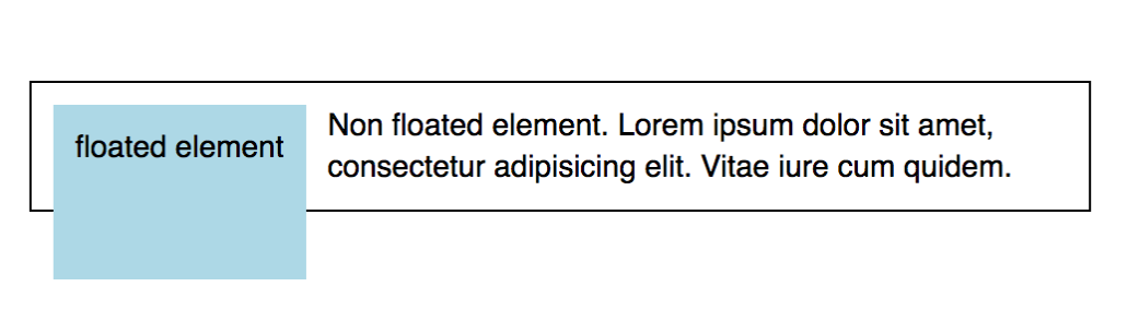
- Floating the blue box increased its height.
- Floating the blue box on the left also moves it down.
- Floating the blue box actually shifts it to the right and down.
- Floating the blue box took it out of document flow and the container is sized only to the sample text.
Q112. Given this code, which CSS declaration of .overlay will span the entire width and height of its container?
<style>
.container {
  position: relative;
  height: 200px;
  width: 200px;
  border: 1px solid black;
}
</style>
<div class="container"><div class="overlay"></div></div>
- A
.overlay {
  position: static;
  top: 200px;
  bottom: 200px;
  right: 200px;
  left: 200px;
  background-color: rgba(0, 0, 0, 0.5);
}
- B
.overlay {
  position: absolute;
  top: 200px;
  bottom: 200px;
  right: 200px;
  left: 200px;
  background-color: rgba(0, 0, 0, 0.5);
}
- C
.overlay {
  position: static;
  top: 0;
  bottom: 0;
  right: 0;
  left: 0;
  background-color: rgba(0, 0, 0, 0.5);
}
- D
.overlay {
  position: absolute;
  top: 0;
  bottom: 0;
  right: 0;
  left: 0;
  background-color: rgba(0, 0, 0, 0.5);
}
Q113. Which missing line of code would place the text on top of the image?
<div class="container">
  <img src="grumpy-cat.gif" />
  <p>The z-index property is cool!</p>
</div>
img {
  position: absolute;
  left: 0px;
  top: 0px;
  // Missing line
}
z-index: 1;z-index: -1;z-index: 0;z-index: true;
Q114. To make the font size of an element one size smaller than the font size of the element’s container, which style property would you apply?
font-size: reduce;font-size: 8px;font-size: -1em;font-size: smaller;
Q115. Given this markup, which selector would result in the text being highlighted in yellow?
<span class="highlight">#BLM</span>
- A
.highlight {
  background-color: yellow;
}
- B
#highlight {
  background-color: yellow;
}
- C
.highlight {
  color: yellow;
}
- D
#highlight {
  color: yellow;
}
Q116. To prevent a background image from tiling in any direction, which style property would you apply?
- A
background-repeat: no-repeat;
- B
background-repeat: fixed;
- C
background-repeat: none;
- D
background-tile: none;
Q117. To rotate an object 30 degrees counterclockwise, which style property would you apply?
transform: rotate(-30deg);transform: rotate(30deg);rotate: 30deg;spin: 30deg;
Q118. Which style rule would you apply to set the background image to display the contents of the wood.png file?
background-image: file('wood.png');background-image: url('wood.png');background-image: wood.png;image: wood.png
Q119. What style rule would set the font color of only paragraph two to blue?
<section><p>paragraph one</p></section><p>paragraph two</p>
- A
section > p {
  color: blue;
}
- B
p {
  color: blue;
}
- C
section + p {
  color: blue;
}
- D
p + section {
  color: blue;
}
Q120. You want to move an element up 100px. Which CSS property would you use?
transform: translateX(-100px)transform: translateY(-100px)transform: translateY(100px)transform: translateX(100px)
Q121. Which style will horizontally center the inner <div> within the outer <div>?
<div id="outer">
  <div id="inner">Center Me!</div>
</div>
- A
#inner {
  width: 50%;
}

#outer {
  width: 100%;
}
- B
#inner {
  left: 0;
  right: 0;
  position: center;
}
- C
#inner {
  text-align: center;
}
- D
#inner {
  width: 50%;
  margin: 0 auto;
}
Q122. Which corner will the puppy be in when these CSS rules are applied?
.pen {
  height: 100px;
  width: 100px;
  border: 2px dashed brown;
  position: relative;
}

#puppy {
  position: absolute;
  right: 80px;
  bottom: 0px;
}
<div class="pen">
  <span id="puppy">:dog:</span>
</div>
- top-right corner
- bottom-right corner
- top-left corner
- bottom-left corner
Q123. Which choice uses the correct syntax for adding a hover pseudo-class to <a> element?
a:hover {...}a :hover {...}a.hover {...}a hover {...}
Q124. Which missing code will give “Cellar Door” a shadow?
  <style>
    #cellar-door {
      box-shadow: 3px 5px 10px #000;
    }
    .text-shadow {
      text-shadow: 3px 5px 10px #000;
    }
  </style>

  <h1 _____> Cellar Door</h1>
class="text-shadow"id="cellar-door"id="text-shadow"class="cellar-door"
Q125. Which choice is a valid example of a comment in CSS?
-- This line has been cancelled./* This line has been cancelled. */// This line has been cancelled.# This line has been cancelled.
Q126. Which element(s) will be displayed in blue text?
    h2 ~ p {
      color: blue;
    }
  <section>
    <p>P1</p>
    <h2>H2</h2>
    <p>P3</p>
    <p>P4</p>
  </section>
- P3
- P1, P3 and P4
- P3 and P4
- P1
Q127. When these pseudo-class selectors are applied to a link, what states will the styles be applied to?
a:visited {
  ...;
}
a:active {
  ...;
}
a:hover {
  ...;
}
a:focus {
  ...;
}
:visitedstyles are applied after the link has been opened.:activestyles are applied on mouse click and hold.:hoverstyles are applied on mouse over or mouse click and hold.:focusstyles are applied when a Tab key on a keyboard is used to navigate through links.:visitedstyles are applied after the link has been opened.:activestyles are applied on mouse click.:hoverstyles are applied on mouseover.:focusstyles are applied on mouse click and hold, or when a Tab key on a keyboard is used to navigate through links.:visitedstyles are applied after the link has been opened.:activestyles are applied on mouse click only and before mouse release.:hoverstyles are applied on mouseover.:focusstyles are applied when a Tab key on a keyboard is used to navigate through links.:visitedstyles are applied on mouse hold.:activestyles are applied when the link has been opened.:hoverstyles are applied on mouseover.:focusstyles are applied when a Tab key on a keyboard is used to navigate through links.
Q128. What style rule should you use to display all input elements that have failed the validation test with a red font?
- A
input.valid[false] {
  color: red;
}
- B
input:invalid {
  color: red;
}
- C
input.not(valid) {
  color: red;
}
- D
input.invalid {
  color: red;
}
Q129. What style rule should you apply to the img element to display the element in grayscale with no color?
- A
img {
  transform: grayscale(1);
}
- B
img {
  filter: grayscale(0);
}
- C
img {
  transform: grayscale(0);
}
- D
img {
  filter: grayscale(1);
}
Q130. Why might you create a reset style sheet?
- to reduce page size by removing browser styles from the page rendering.
- to start designing a page style by overriding any built-in browser styles
- to make it easier to minify the content of your web page design
- to increase execution time by not relying on built-in browser styles
Q131. How would you absolutely position an element of the logo class inside of a relatively positioned container?
- A
.logo {
  position: absolute;
  padding-left: 100px;
  padding-top: 150px;
}
- B
.logo {
  position: absolute;
  left: 100px;
  top: 150px;
}
- C
.logo {
  position: absolute;
  left-padding: 100px;
  top-padding: 150px;
}
- D
.logo {
  position: absolute;
  margin-left: 100px;
  margin-top: 150px;
}
Q132. How would the <div> with the class .child be positioned within its container?
<style>
  .container {
    height: 200px;
    width: 200px;
  }
  .child {
    margin: auto 0;
    height: 100px;
  }
</style>
<div class="container">
  <div class="child">...</div>
</div>
- horizontally centered
- vertically centered, spanning the container’s width
- at the bottom of the container, spanning the container’s width
- at the top of the container, spanning the container’s width
Q133. By default, a CSS transition is __
- asymmetric, so that the transition going from the initial state to the end state is different from the transition going from the end state back to the initial state.
- one-sided, so that there is only one transition and it goes from the initial state to the end state.
- symmetric, so that the transition going from the initial state to the end state is the reverse of the transition going from the end state back to the initial state.
- one-sided, so that there is only one transition and it goes from the end state to the initial state.
Q134. Which style rule will extend the header element across an entire grid row from the first column through the last column?
- A
header {
  grid-column: 1 / auto;
}
- B
header {
  grid-column: 1/-1;
}
- C
header {
  grid-column: -1/1;
}
- D
header {
  grid-column: 1/100%;
}
Q135. To center the content of a grid cell horizontally and vertically within the cell, which style rule should you apply?
- A
align-items: start;
justify-items: end;
- B
align-items: center;
justify-items: center;
- C
align-items: middle;
justify-items: middle;
- D
align-items: stretch;
justify-items: stretch;
Reference for align-items Reference for justify-items
Q136. What style rule should you use to display all input elements that have failed the validation test with a red font?
- A
input.valid[false] {
  color: red;
}
- B
input:invalid {
  color: red;
}
- C
input.not(valid) {
  color: red;
}
- D
input.invalid {
  color: red;
}
Q139. To insert an external style sheet file into another style sheet file, which rule should you use?
@import@link@insert@style
Q140. Given this code, how tall will the following element be in pixels?
<style>
  #tall-text {
    display: inline;
    font-size: 20px;
    height: 200px;
  }
</style>

<p id="tall-text">Did I grow?</p>
- 200px
- 20px
- 180px
- 220px
Q141. Which style rule will place an X within the grid to win the game?
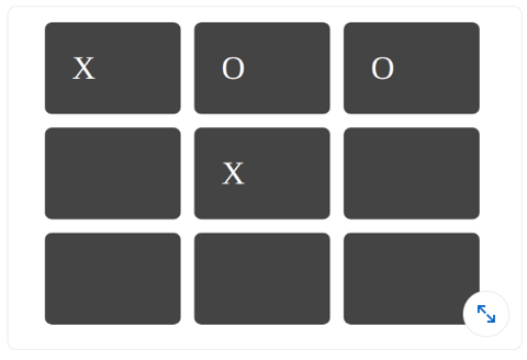
- row: 3; column: 3;
- grid-row: 3; grid-column: 3;
- row: 2; column: 2;
- grid-row: 2; grid-column: 2;
Q142. Which CSS property is used to create an image reflection?
- box-reflect
- img-reflect
- None of the above
- reflect-img
Q143. What is the general syntax of writing the var() function?
- var(--name, value)
- var(--name)
- var(value)
- None of the Above
Q143. How many layout modes were there before the Flexbox Layout Module was introduced in CSS?
- 2
- 1
- 4
- 3
Q144. Which of the following components of the CSS box model are transparent?
- Padding
- Margin
- Both A and B
- None
Q145. How are custom fonts defined using CSS?
- @Font-Face Rule
- Custom font cannot be defined
- src tags
- None of the above
Q146. Which of the following CSS properties sets what kind of line decorations are added to an element, such as underlines, overlines, etc?
- text-decoration
- text-style
- text-decoration-line
- text-line
Q147. Which of the following CSS Properties sets the stacking order of positioned elements?
- y-index
- z-index
- x-index
- all of the mentioned
Q148. Which of the following properties allows a marquee to be used in the case of a text overflow?
- overflow-marquee
- overflow-style
- overflow-text
- none of the mentioned
Q149. Which of the following Cascading order has the highest precedence?
- user agent declarations
- user normal declarations
- author normal declarations
- author important declarations
Q150. The CSS cascade assigns a weight to each style rule.
- True
- False
Q151. The **____** represents the result of the cascade: it is the declared value that wins the cascade.
- specified Value
- actual value
- computed value
- cascaded value
Q152. Using negative text-indent is also known as _?
- The Scott Kellum method
- The Phark method
- Radu Darvas Technique
- The Langridge method
Q153. Using margin is also known as _?
- Fahrner image replacement
- The Lindsay method
- Radu Darvas Technique
- The Langridge method
Q154. If a particular rule should never be overridden by another rule, the **____** indication should be used.
- @important
- !important!
- !important
- important!
Q155. What does CSS stand for?
- Creative Style Sheets
- Colourful Style Sheets
- Cascading Style Sheets
- Colourful Style Sheets
Q156. What color would rgb(255,0,0) give?
- Blue
- Green
- Red
- Yellow
Reference: CSS RGB and RGBA Colors
Q157. What is the correct HTML for referring to an external style sheet?
<link rel="stylesheet" type="text/css" href="mystyle.css"><stylesheet>mystyle.css</stylesheet><style src= "mystyle.css">- None of these.
| Reference: HTML link tag | HTML Link Tag Syntax for External CSS Files |
Q158. The <link> tag goes inside:
- the title section
- the body section
- the head section
- None of the above
Q159. What is CSS defined in HTML?
- How to send HTML elements
- How to display HTML elements
- How to save HTML elements
- How to make HTML elements
Q160. Which of the following statements is TRUE for CSS?
- An inline style sheet should be used when a single document has a unique style
- An external style sheet is ideal when the style is applied to many pages
- Both and b above
- An external style sheet can be written in HTML
Q161. In CSS, margin collapsing only happens with?
- The horizontal margins of inline elements in the normal flow.
- The vertical margins of block elements in the normal flow.
- The horizontal margins of block elements in the normal flow.
- The vertical margins of inline elements in the normal flow.
Reference: CSS Margin Collapse
Q162. Which of the following CSS selectors selects all <p> elements that are the direct child of a <div> element?
- div p
- div > p
- Tdiv + p
- div ~ p
Q163. In CSS, the box-sizing property is used to control how an element’s total width and height are calculated. Which value of box-sizing includes the element’s padding and border within its total width and height?
- content-box
- padding-box
- margin-box
- border-box
Reference: CSS box-sizing Property
Q164. In CSS, which of the following is NOT an effect of an inert attribute?
- Prevents the click event from being fired when the user clicks on an element.
- Makes the element interactive.
- Prevents the focus event from being fired when an element gains focus.
- Hides the element and its content from assistive technologies by excluding them from the accessibility tree.
Reference: HTML inert attribute - MDN
Q165. What elements does the accent-color property target?
- Line break tags
- Hyperlink tags
- Input tags
- Image tags
Reference: CSS Line Height Property
Q166. In CSS, what does the line-height property control?
- The width of the element.
- The color of the text.
- The spacing between characters.
- The height of the space between lines of text.
Q167. What is the purpose of the CSS visibility property?
- To control the order of elements within a flex container.
- To adjust the space between the inner content and the border of an element.
- To control the stacking order of elements in the z-axis.
- To control the visibility of an element.
Reference: CSS Visibility Property - W3Schools
Q168. Which CSS property is used to change the style of the cursor when it hovers over an element?
- cursor-style
- mouse-pointer
- pointer-type
- cursor
Q169. What is the purpose of the CSS outline property?
- To control the width of an element’s border.
- To change the background color of an element.
- To create a visible outline around an element, which is often used for accessibility or highlighting.
- To control the transparency of an element.
Reference: CSS outline Property - W3Schools
Q170. What are the valid values of the text-align property?
- left, bottom, top, right
- left, right, up, bottom
- left, center, right, justify
- side, justify, up, down
Reference: CSS text-align Property - W3Schools
Q171. What is the difference between visibility: hidden and display: none?
- Both will hide the element on the page, but display: none has greater browser support.
display:none hides the elements but maintains the space it previously occupied. visibility:hidden will hide the element from view and remove it from the normal flow of the document- visibility: hidden hides the element, but it still takes up space in the layout.
- display: none removes the element from the document. It does not take up any space.
There is no difference; both will hide the element on the page
Reference: CSS visibility:hidden vs display:none
Q172. Which of the following is NOT a valid CSS selector?
p.class#id-
-Reference: CSS Selectors – Cheat SheetQ173. What is the difference between a class and an id in CSS?
- IDs can only be applied to one HTML element, while classes can be used multiple times.
- IDs are denoted by a period (.) followed by the ID name, while classes use a hash (#).
- Classes have higher specificity in CSS than IDs.
- There is no difference between a class and an id.
Reference: Difference Between Class and ID
Q174. Which CSS property is used to create a grid container?
grid-templatedisplay: gridgrid-containergrid-layout
Q175. What is the correct syntax for CSS custom properties (variables)?
$primary-color: blue;--primary-color: blue;@primary-color: blue;var-primary-color: blue;
Reference CSS Custom Properties
Q176. Which flexbox property is used to control the alignment of items along the main axis?
align-itemsjustify-contentflex-directionalign-content
Q177. What does the fr unit represent in CSS Grid?
- Fixed ratio
- Fractional unit
- Frame rate
- Font ratio
grid-template-columns: 1fr 2fr 1fr;
Q178. Which CSS property is used to create smooth transitions between property changes?
animationtransitiontransformease
Q179. What is the purpose of the clamp() function in CSS?
- To hide content
- To set a value between a minimum and maximum range
- To create animations
- To validate CSS
font-size: clamp(1rem, 2.5vw, 2rem);
Q180. Which CSS selector targets the first child element?
:first:first-child:child(1):nth(1)
Q181. What does the aspect-ratio property do?
- Changes the image quality
- Sets the preferred aspect ratio for an element
- Adjusts the viewport ratio
- Controls the screen ratio
Q182. Which CSS property is used to create a sticky element?
position: fixedposition: stickyposition: absoluteposition: relative
Reference CSS position: sticky
Q183. What is the correct syntax for CSS Grid areas?
grid-template-areas:
  'header header header'
  'sidebar main main'
  'footer footer footer';
- The above syntax is correct
- Use square brackets instead of quotes
- Use commas between area names
- Use semicolons between rows
Reference CSS Grid Template Areas
Q184. Which CSS function is used to calculate values?
compute()calc()calculate()math()
width: calc(100% - 20px);
Q185. What does the gap property do in CSS Grid and Flexbox?
- Creates gaps in text
- Sets the space between grid items or flex items
- Creates empty elements
- Adjusts line height
Q186. Which CSS property is used to control the stacking order of elements?
stack-orderz-indexlayerdepth
Q187. What is the purpose of the contain property in CSS?
- To hide overflow content
- To optimize rendering performance by containing layout, style, paint, or size
- To create containers
- To validate content
Q188. Which CSS selector targets elements based on their attribute values using wildcards?
[attr="value"][attr*="value"][attr~="value"][attr|="value"]
/* Selects elements where href contains "example" */
a[href*='example'] {
  color: red;
}
Reference CSS Attribute Selectors
Q189. What does the object-fit property control?
- Object positioning
- How replaced content should be resized to fit its container
- Object visibility
- Object rotation
Q190. Which CSS property is used to create rounded corners?
corner-radiusborder-radiusround-cornersradius
Q191. What is the purpose of the will-change property?
- To change element content
- To hint to the browser about upcoming changes for optimization
- To force changes
- To prevent changes
Q192. Which CSS function is used to create color gradients?
gradient()linear-gradient()orradial-gradient()color-gradient()blend()
Q193. What does the scroll-behavior property control?
- Scrollbar appearance
- The scrolling behavior for a scrolling box
- Scroll speed
- Scroll direction
html {
  scroll-behavior: smooth;
}
Q194. Which CSS property is used to control text overflow?
text-wraptext-overflowoverflow-texttext-clip
Q195. What is the purpose of the backdrop-filter property?
- To filter background images
- To apply graphical effects to the area behind an element
- To create drop shadows
- To filter text content
Q196. Which CSS property is used to create CSS animations?
transitionanimationtransformkeyframes
Q197. What does the place-items property do in CSS Grid?
- Places items in specific grid areas
- Shorthand for align-items and justify-items
- Creates item placeholders
- Positions items absolutely
Q198. Which CSS selector targets the last child element?
:last:last-child:child(last):final-child
Q199. What is the purpose of the isolation property?
- To isolate elements from the DOM
- To create a new stacking context
- To prevent event propagation
- To isolate CSS rules
Q200. Which CSS property controls the space between characters?
character-spacingletter-spacingchar-spacetext-spacing
Q201. What does the overscroll-behavior property control?
- Scrollbar behavior
- What happens when the user over-scrolls
- Scroll speed
- Scroll direction
Reference CSS overscroll-behavior
Q202. Which CSS property is used to create drop shadows?
shadowbox-shadowdrop-shadowelement-shadow
Q203. What is the purpose of the resize property?
- To resize images automatically
- To control whether an element is resizable by the user
- To resize fonts
- To resize the viewport
Q204. Which CSS function is used to create custom shapes?
shape()clip-path()path()polygon()
Q205. What does the mix-blend-mode property do?
- Mixes colors randomly
- Defines how an element’s content should blend with its background
- Creates color transitions
- Adjusts color saturation